Saturday, December 31, 2016

Retrospect 2016 - End Well


It is good to start well, but it is even better to end well.

Following on from last year, under some sort of master plan to end well, I made a list of what I should prioritize:
  1. Be a better christian
  2. Make a game
  3. Play the piano
  4. Stay fit
  5. Draw
  6. Speak Japanese / Play Japanese songs
In actuality, I put more effort into items 2 through 6 than into being a better christian. It's quite a pitiful effort if I can only scrape together half a day in a year to spend with the maker of time. Some consolation is that I make coffee at church once a month, and can sometimes draw some latte art.


In making a game, I started again (again, again, again). Yeap, found the 99th way that doesn't work. After going through C++ dependency management using maven, biicode, and conan, I settled on Rust. I managed to make a program that can talk to different endpoints:


For piano, I've been practicing Five for Fighting's 100 Years, and Tenth Avenue North's By Your Side and Fighting For You. Perhaps one day I can use this for priority one.

In fitness, I joined work's Ultimate Frisbee team. It was the first time I played in a team sport, and it is far more exciting than long distance running. Still, a good run and workout feels good, and I keep that up at least once a week.


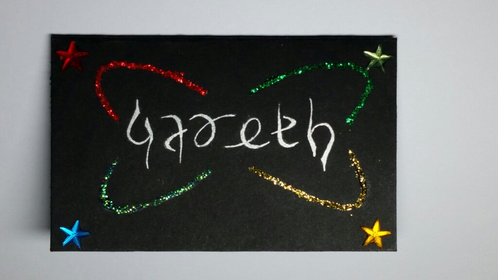
On paper, there's always a chance to make someone's day better. Check out this year's cards at cards.azriel.im:


Japanese is still a desire at arm's distance. I did spend a steady amount of time on it during work lunches in the earlier half of the year, but somehow didn't manage to keep it up. Maybe later. We'll see.

Sunday, June 12, 2016

Ambigram Tutorial

Someone asked how I make ambigrams, so here are the steps I use to draw them:
  1. Pick a person's name, and write it down.

  2. Come up with the skeleton or "wire-frame" of the ambigram.
    1. First, write the name below itself to find the corresponding rotated letter. You can also use uppercase instead of lowercase as it may be a more suitable fit for the skeleton:

    2. Next, write the name, rotate the page, and write the name over itself, trying to find strokes or lines that match up with each other. This can be quite difficult, as not all letters are balanced. For example, "i" is written within one vertical line, whereas "m" has 3 vertical lines.

    3. Then, try and write the first half of the name. For each letter or stroke, you have to try and make it rotationally symmetric with the corresponding end letter.
      If the name has an odd number of letters, include the middle one.

      You only have to do the first half, because you can rotate the page and get the second half.
      You may want to do this a few times to make it fit the letters better.
  3. Apply a font onto the skeleton.

    Just kidding. I just searched for fonts that that looked like what I had drawn.
    But for this step it really is just trial and error in scribbling around, and settling on what looks good. You can google for inspiration from different font styles, or what used to do is open Microsoft Word, type the name in font size 72, and preview it in different fonts.
  4. Transfer the ambigram to a card.
    This step is where you're actually touching the final product, so you want to do it well.
    Start from the middle. Unless you have a robotic arm (and sometimes not even then), the second half of the ambigram you drew in step 3 most likely doesn't look the same as the first half. So on the final product, start from the middle, and draw outwards towards the left and right, rotating the card constantly to do the same stroke on each side.
    Here is the one I did for Mukti a while back (sorry Justin! not enough time right now to do yours):

  5. Colour and decorate the ambigram.
    Good colouring and decorations can make it easier to read the ambigram. Truth is, most of the ones I make, except for the person it is for, most people still have to guess and ask what the ambigram says. But I think that's okay, as perhaps that is why art is understood in different ways.
    There are two styles I have used for a while:
    • Hollow Outline: This lets you colour the inside. I tend to go with 3 to 4 shades of a main colour for the ambigram for the gradient effect, plus a highlight colour using glitter or other gem-type objects.
    • Solid Thin: The ambigram itself is a solid silver, and around it I'll use one or two shades of a highlight colour.
    Those aren't rules, just styles I've been using for a while.
    Here are some ambigrams with the corresponding drafts:


    You can find more on my cards blog.
Enjoy

Saturday, March 26, 2016

Brain Dump


Little questionnaire to figure out your priorities
  1. If the world ended in the following time_period (see below), what would you do in the next hour?
    What do I care about? What is my final legacy?
    • 1 Hour:
    • 7 Days:
    • 3 Years:
    • 20 Years:
    • 100 Years:
  2. If you had the following amount to spend, and 1 month to live, how would you spend it?
    Comfort? First I must survive
    • $100:
    • $1,000:
    • $10,000:
    • $100,000:
    • $1,000,000:
  3. If you could only see / talk to the following number of people for the rest of your life, who would you choose?
    My life revolves because of them
    • 1 Person:
    • 3 People:
    • 10 People:
  4. If you could master the following number of skills, what skills would you pick?
    With these abilities, I give or gain from the world
    • 1 skill:
    • 3 skills:
    • 5 skills:
    • 7 skills:
  5. If you were to only remember the following number of events, and forget all other memories, which ones would you remember?
    I awaken, my mind hazy, and only these events form my identity
    • 1 memory:
    • 2 memories:
    • 3 memories:
    • 4 memories: