Someone asked how I make ambigrams, so here are the steps I use to draw them:
- Pick a person's name, and write it down.

- Come up with the skeleton or "wire-frame" of the ambigram.
- First, write the name below itself to find the corresponding rotated letter. You can also use uppercase instead of lowercase as it may be a more suitable fit for the skeleton:

- Next, write the name, rotate the page, and write the name over itself, trying to find strokes or lines that match up with each other. This can be quite difficult, as not all letters are balanced. For example, "i" is written within one vertical line, whereas "m" has 3 vertical lines.

- Then, try and write the first half of the name. For each letter or stroke, you have to try and make it rotationally symmetric with the corresponding end letter.If the name has an odd number of letters, include the middle one.
 You only have to do the first half, because you can rotate the page and get the second half.You may want to do this a few times to make it fit the letters better.
- Apply a font onto the skeleton.I used Dark Crystal and Gas Huffer Phat.
 Just kidding. I just searched for fonts that that looked like what I had drawn.But for this step it really is just trial and error in scribbling around, and settling on what looks good. You can google for inspiration from different font styles, or what used to do is open Microsoft Word, type the name in font size 72, and preview it in different fonts.
 - Transfer the ambigram to a card.This step is where you're actually touching the final product, so you want to do it well.Start from the middle. Unless you have a robotic arm (and sometimes not even then), the second half of the ambigram you drew in step 3 most likely doesn't look the same as the first half. So on the final product, start from the middle, and draw outwards towards the left and right, rotating the card constantly to do the same stroke on each side.Here is the one I did for Mukti a while back (sorry Justin! not enough time right now to do yours):

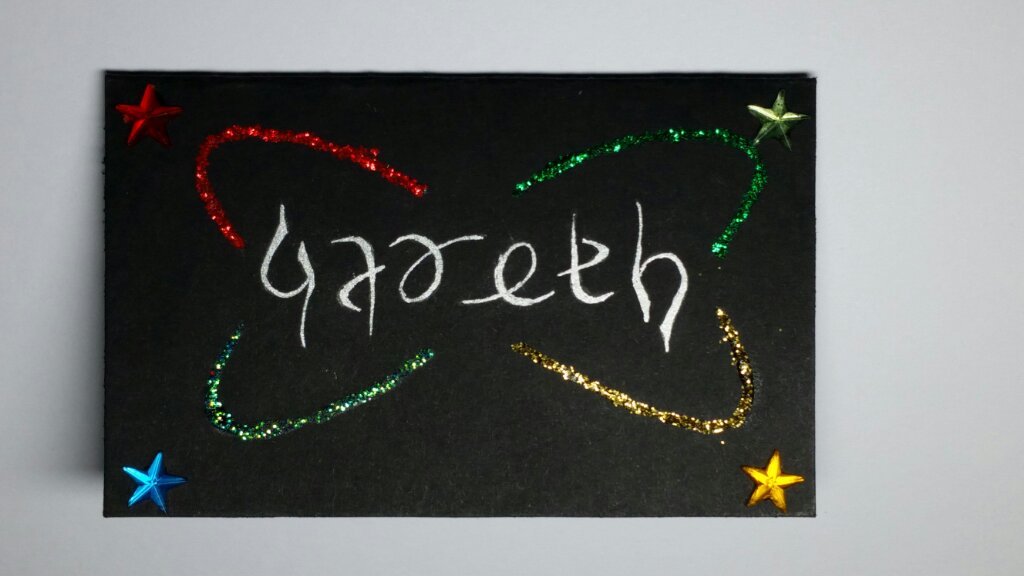
- Colour and decorate the ambigram.Good colouring and decorations can make it easier to read the ambigram. Truth is, most of the ones I make, except for the person it is for, most people still have to guess and ask what the ambigram says. But I think that's okay, as perhaps that is why art is understood in different ways.There are two styles I have used for a while:
- Hollow Outline: This lets you colour the inside. I tend to go with 3 to 4 shades of a main colour for the ambigram for the gradient effect, plus a highlight colour using glitter or other gem-type objects.
- Solid Thin: The ambigram itself is a solid silver, and around it I'll use one or two shades of a highlight colour.
Those aren't rules, just styles I've been using for a while.Here are some ambigrams with the corresponding drafts:


 You can find more on my cards blog.


Enjoy